PSEUDO
TYPOGRAPHY MOTION
SPRING 2023
PROJECT SUMMARY
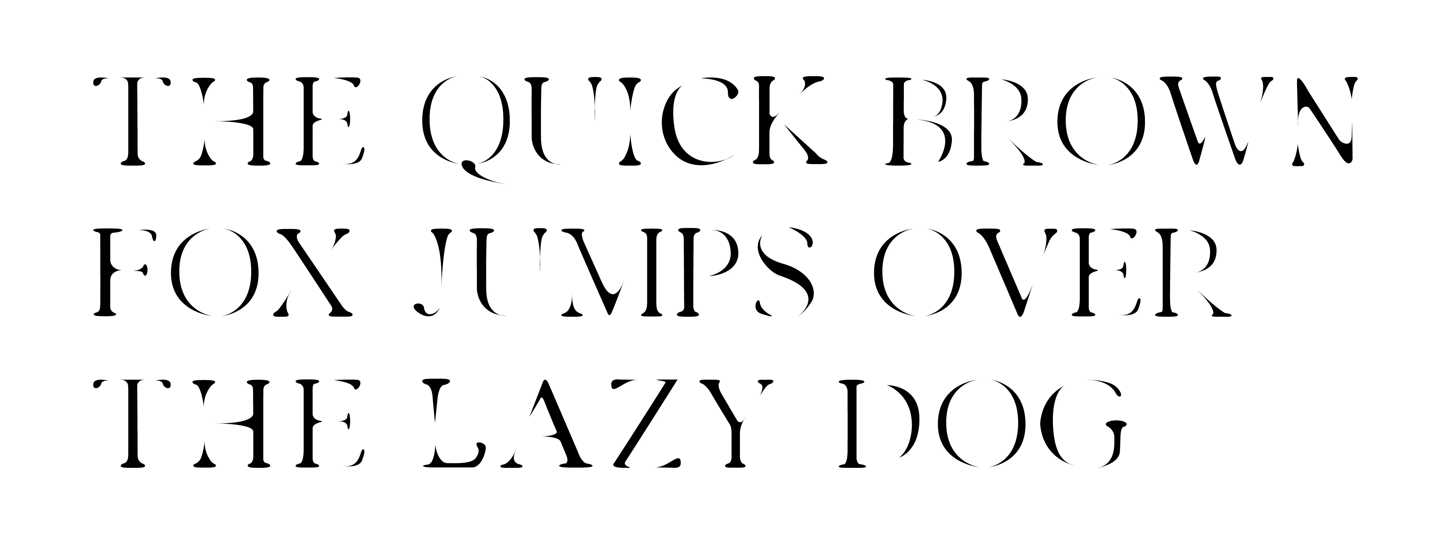
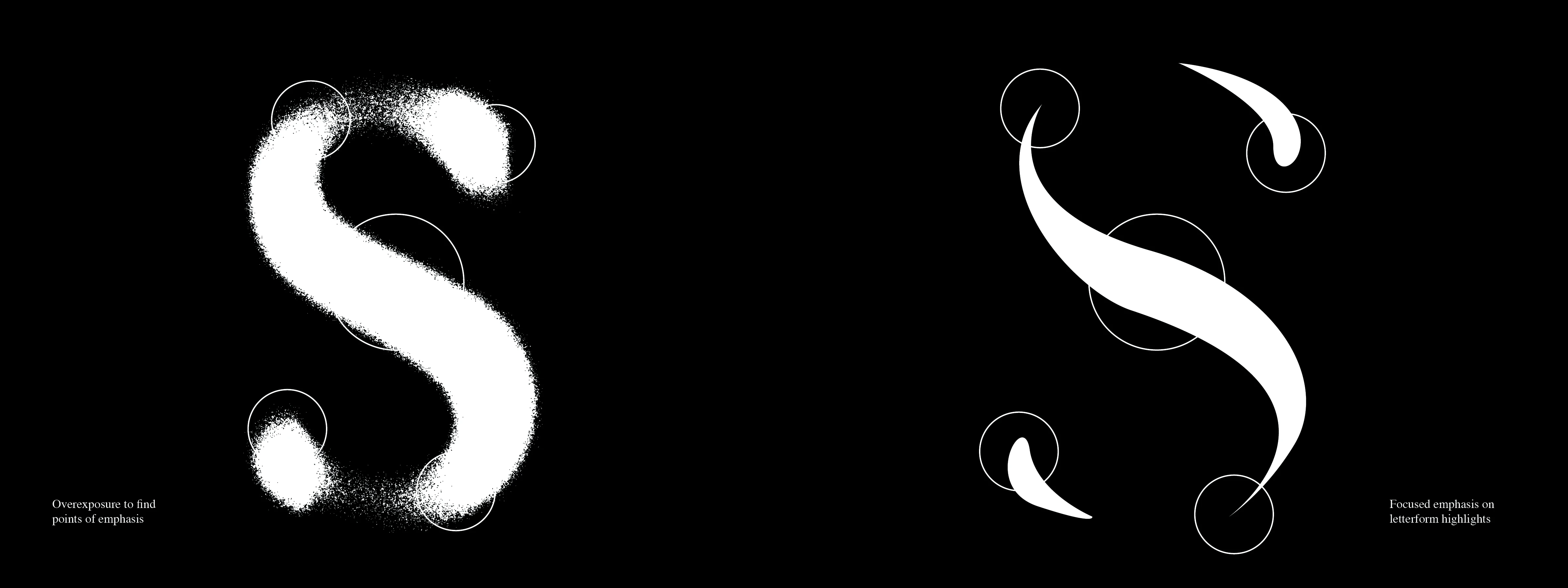
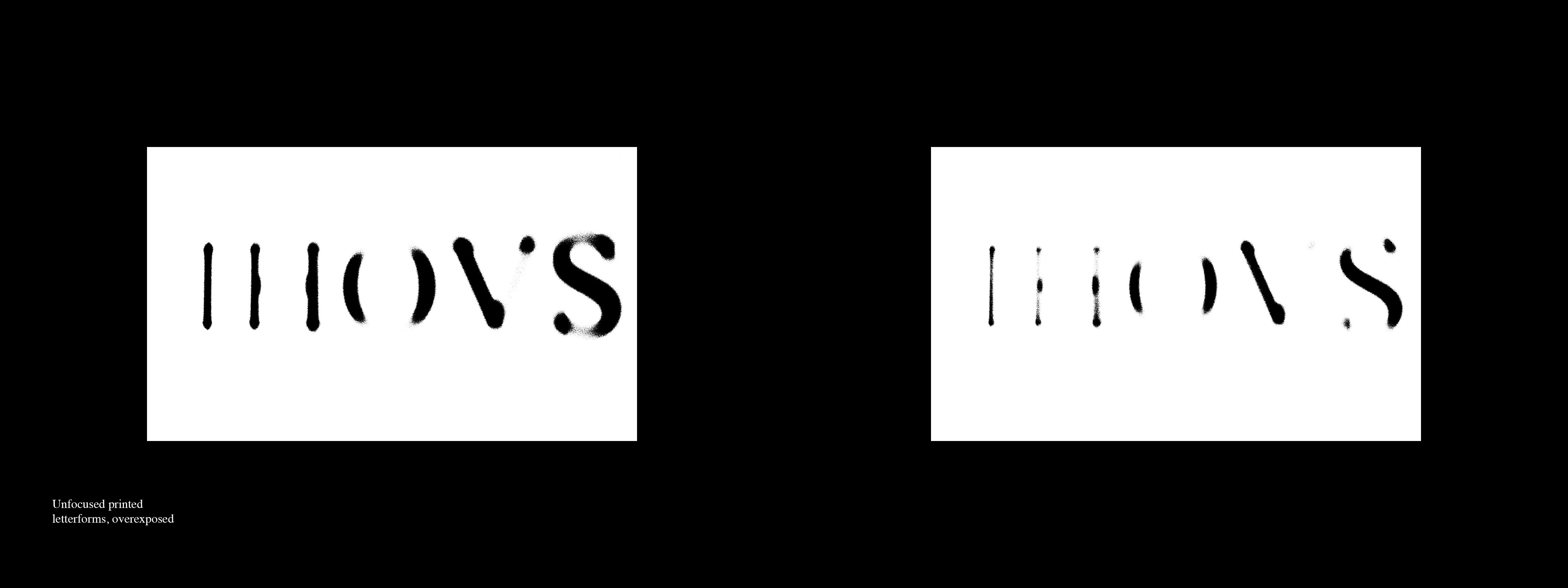
Pseudo is a capital display typeface meant to imitate the effects of having blurry vision. Based on my own vision, and focusing on the highlights and emphasis of each letterform, I strove to create a typeface that didn't rely on any blur effect, and is just pure letter. The base form of the typeface is based around Times New Roman. The goal was to take one of the most well-known typefaces and distort it, into something that is similar to how I, and many others with vision problems see the world.
CONTENTS
-A-Z Caps typeface
-Numbers & Glyphs
-Type specimen
-Applications

TYPELINE

MOTION
TYPE SPECIMEN


TYPE SPECIMEN
SIDE 2

TYPE SPECIMEN
DOWNLOAD

PROCESS


